The tell-all on how I completed my 9-month drawing boot camp.
Rediscovering art. This gap year it’s been a pleasure to plunge back into the fine arts. I’m proud to have worked my way through the self-help book, Drawing on the Right Side of the Brain, having finished the last chapter after a short detour down to Southern California. I thought I couldn’t draw, but I can and I do. Such a brilliant book!
And it really has been a fun adventure. To do activities not involving number crunching and screen time has been bliss. The serenity of studying, imagining, and drawing my subject. The feeling of fulfillment when I’ve finished my piece. I self-critique my work, but only in the most healthy, gratifying, exuberant ways.
I’ve learned about the techniques of master artists and the way the human mind works. Let’s start with the mind first. The right brain processes our perceptions, including what we see. The left is logical, attaching meaning and context to what we see.
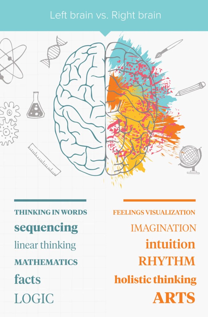
But something magical happens when the two brains talk to each other. The left looks at a few clues, passed from the right, and says: Aha! I know exactly what that is! Then the right brain switches away from visual processing and—like an autofill function—imagines the remaining details from memory and symbolic shortcuts. It doesn’t take much to know Barack Obama is Barack Obama. Unless we’re really looking at him intentionally, we’re just seeing a symbolic, cookie-cutter version of him. This let’s our eyes rest, at least most of the time.
Drawing is the act of reverse engineering this process. What does the right side of the brain see in the instant when specks of light enter our eyes? Obama has funny ears, but what does that really mean? If we focus, we may notice his ears have dozens of tiny shapes, lines, angles, and shades that, taken as a whole, translate as “funny.” Much of what’s funny may have nothing to do with his ears, but more to do with how his ears relate to other features around his head. And the proportionality of his head. And the perspective of where we are viewing him from.
Drawing, though, is not about all this analysis. That’s left brain stuff. It’s about achieving awareness of what we truly do see when we look at a point from a certain perspective. Without thinking, naming, or labeling, you record the features exactly as your eyes see them at that exact moment. You provide enough clues for people to perceive a realistic version of the object. Then the viewer’s brain fills in most of the details through their own imagination, just like they are viewing the real thing. Artists call this unity, a mindful expression of your surroundings.
Now here’s my bit about how I learned the techniques of master artists—-
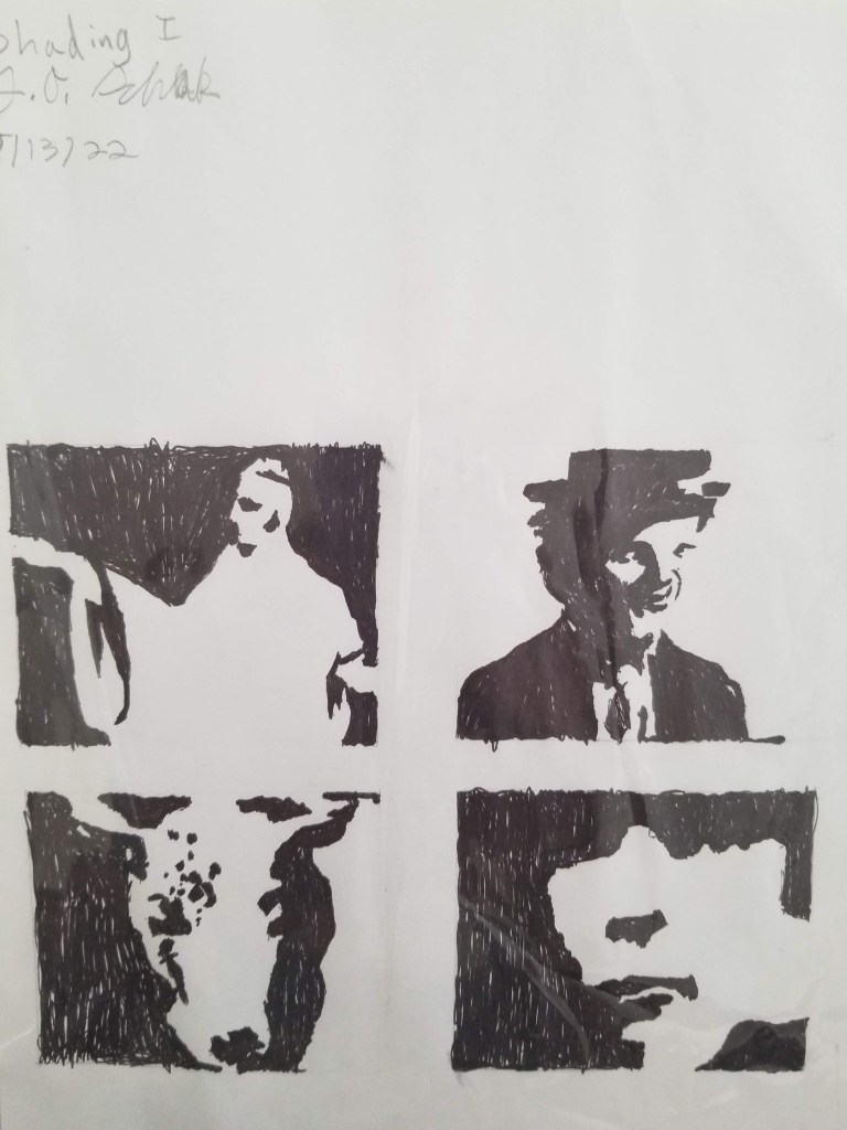
First try. The very first excise in the book has you draw the upside down version of a Picasso. (I turned the drawing right side up for this blog.) This helps you silence your left brain and focus on the individual lines and shapes. This came pretty naturally to me and I felt a confidence boost after finishing my Picasso!
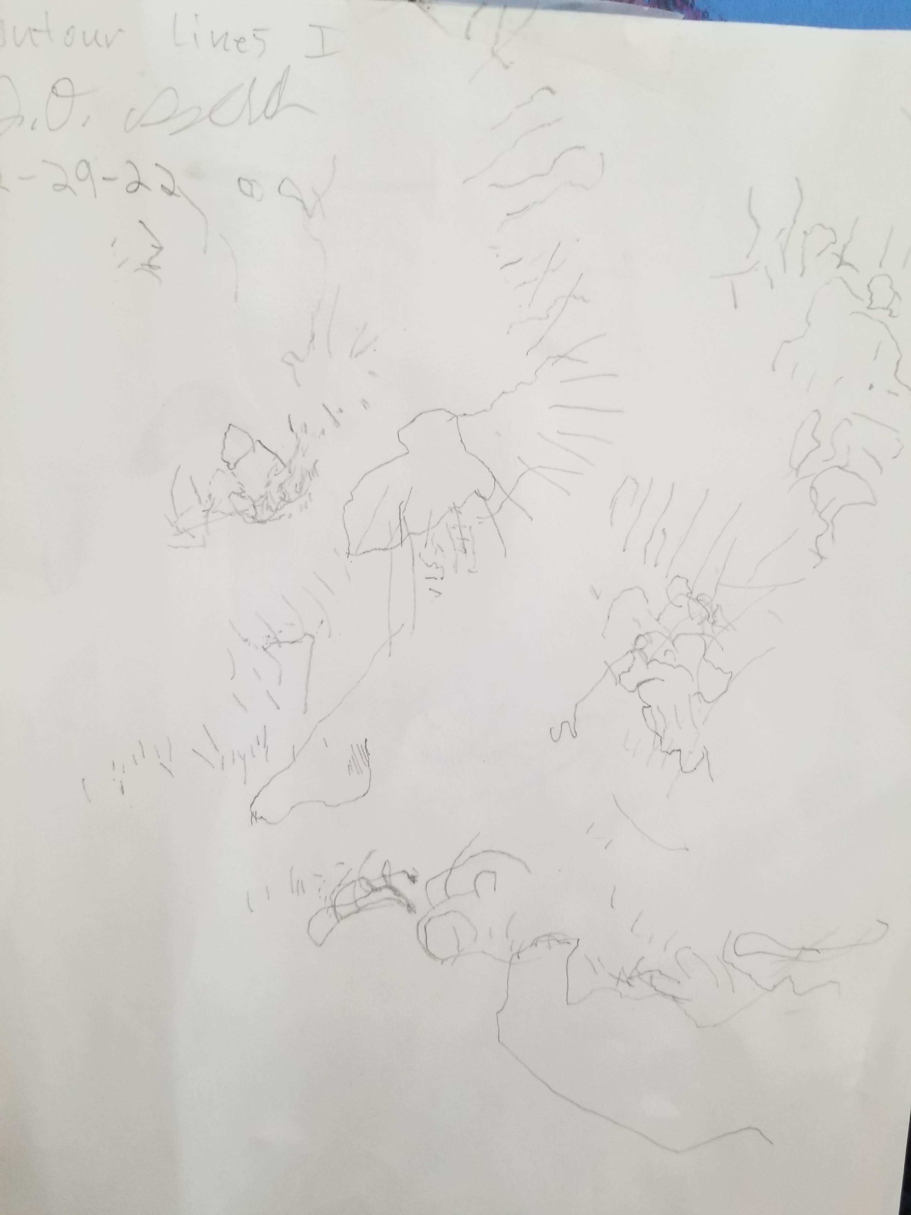
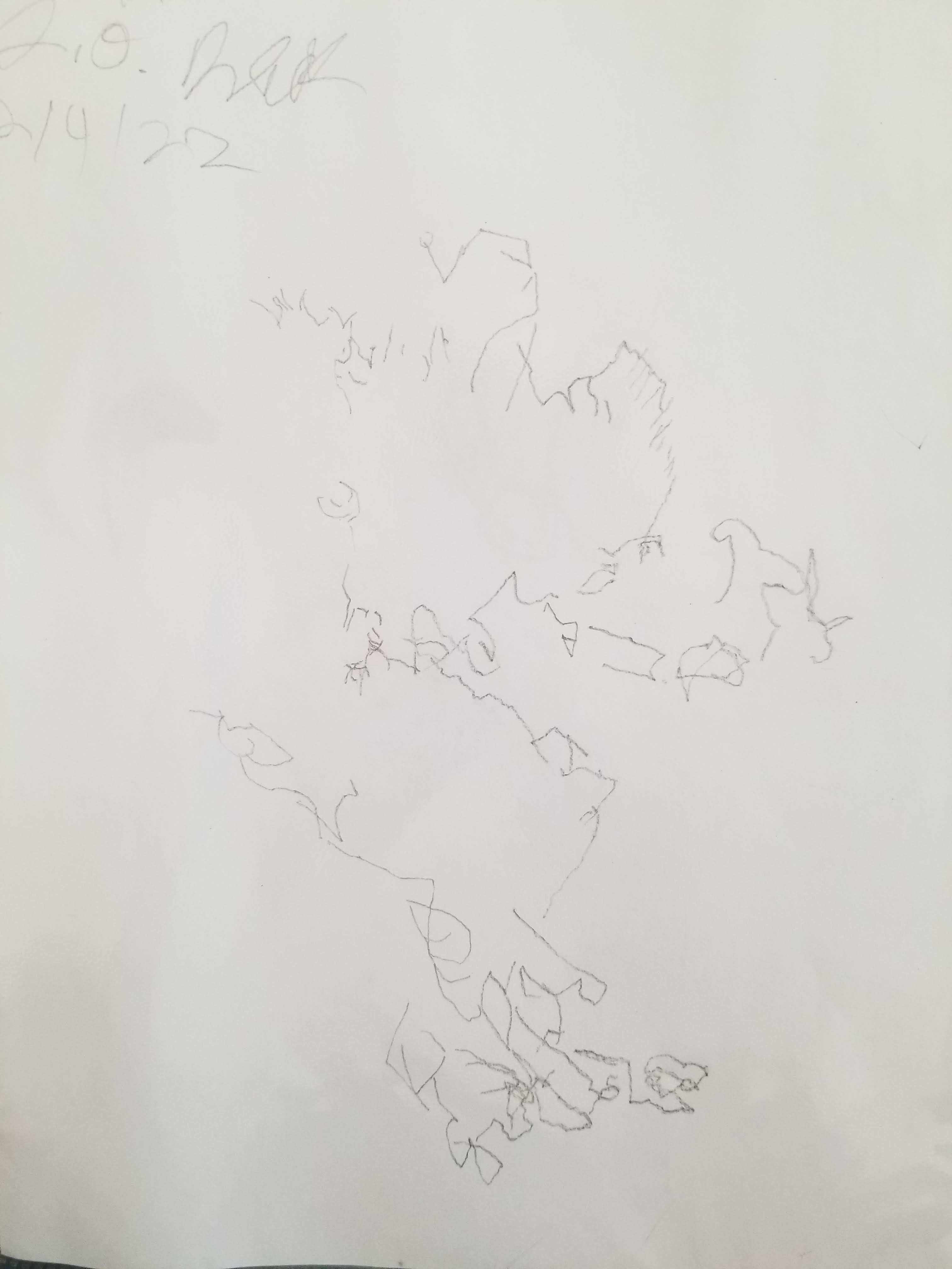
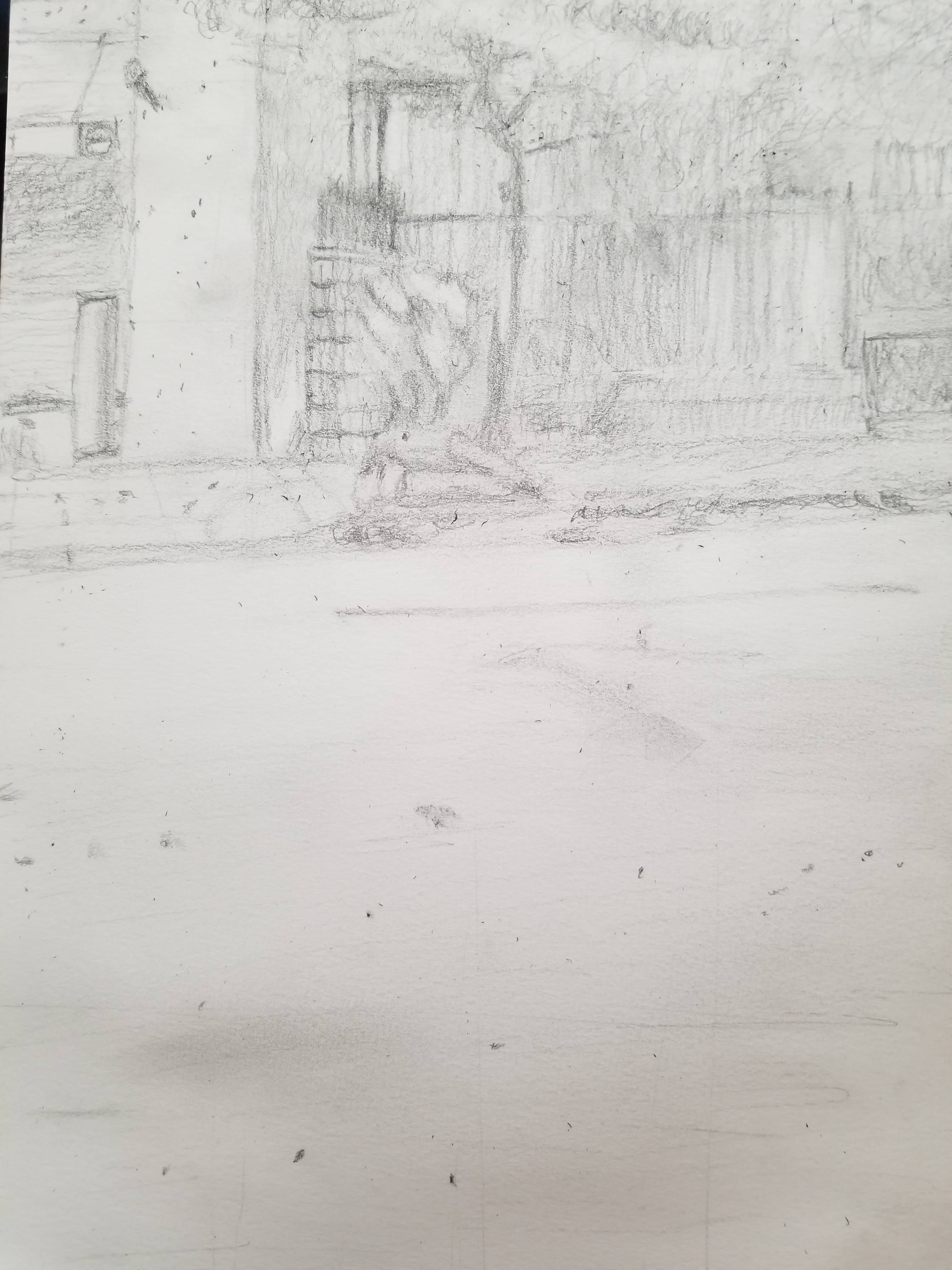
Contour drawing. The building blocks of almost all good drawings are contour lines that can inspire viewers to imagine edges, surfaces, wrinkles, hairs, and just about anything else. Pure contour drawing does not show anything in particular because you are only looking at the object, and never down at the paper. Modified contour drawing creates a recognizable image because you are looking at the paper and object.
BUT master artists spend about 90% of their time studying the object, and only look at the paper to maintain the right proportions, angles, and shades. Much of my time drawing was spent studying where various points and lines were located relative to each other—usually to figure out why the drawing looks off and how to correct it. It’s astonishing the how one shape being slightly too wide, long, flat, curvy, or angular can throw off a whole drawing. Solving the mystery of a drawing is kind of like piecing together a jigsaw puzzle.
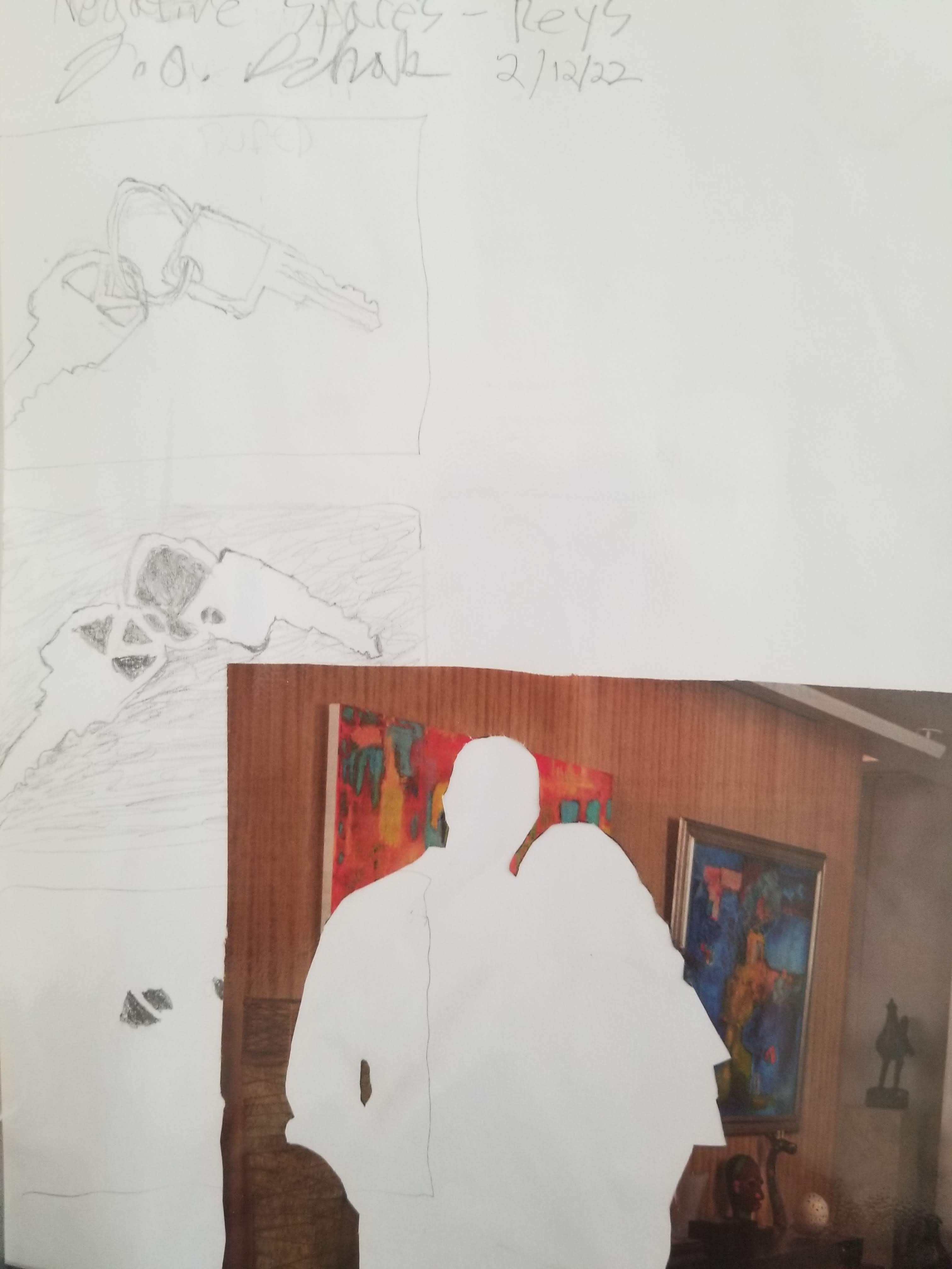
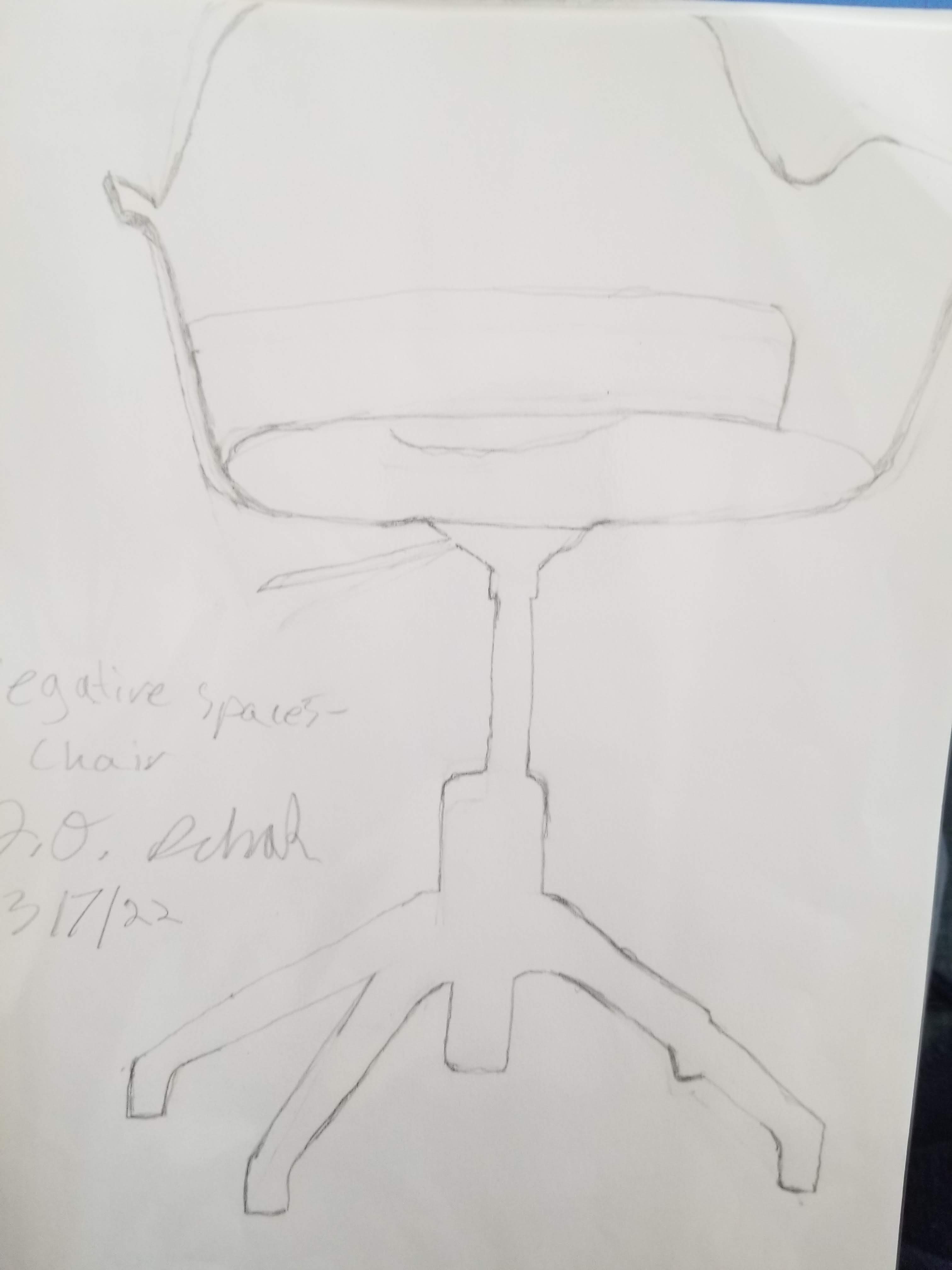
Seeing negative space. The key to any good drawing is to see the negative spaces that exist immediately around objects and within objects. These spaces are no less beautiful or important. Keys fit into a door lock. Chairs take floor space. Teeth have gums and lips around them. Seeing negative space also helps you shift to the right brain, since your left brain is less concerned with attaching names, labels, and shortcuts to these often abstract shapes.
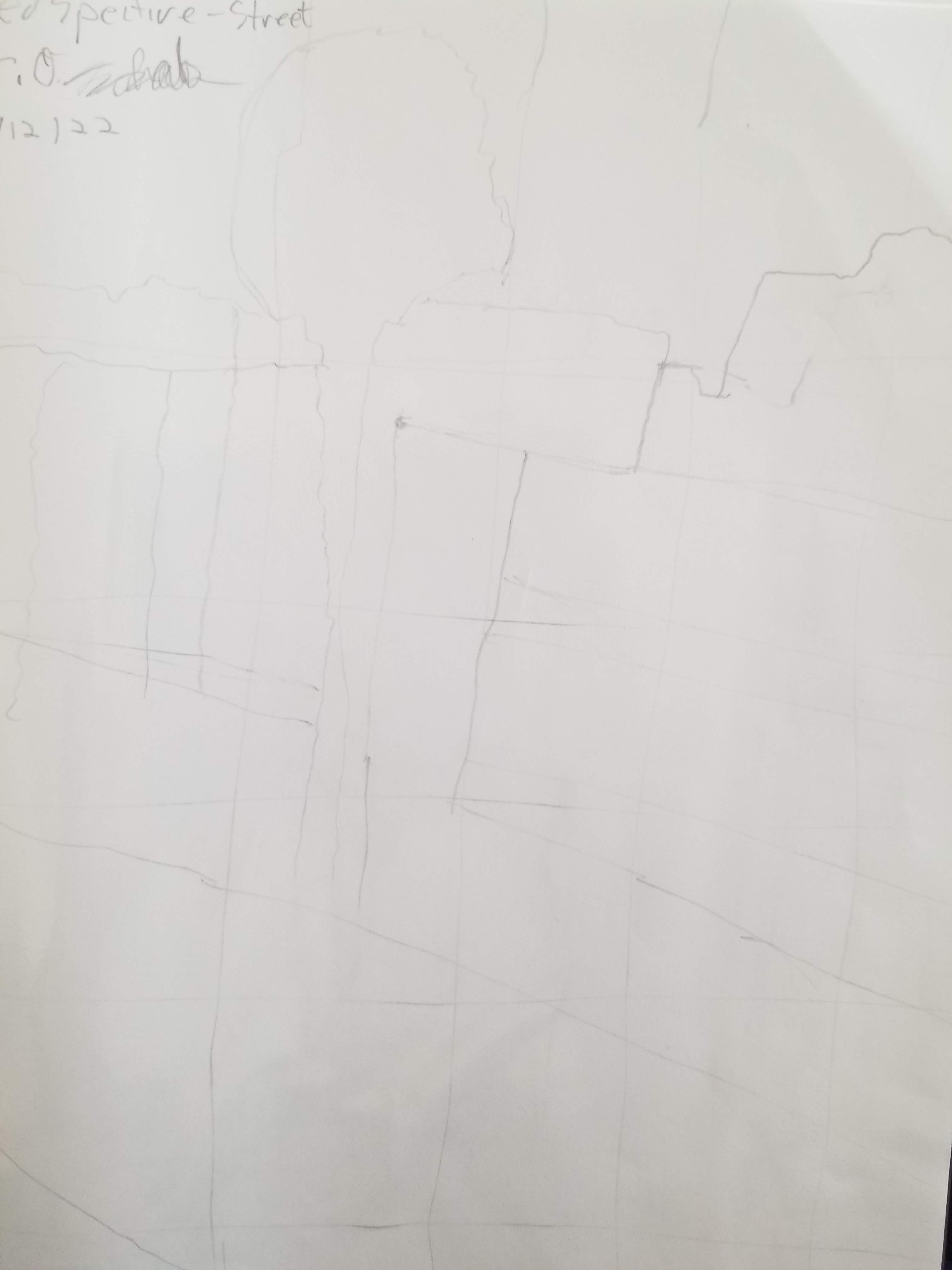
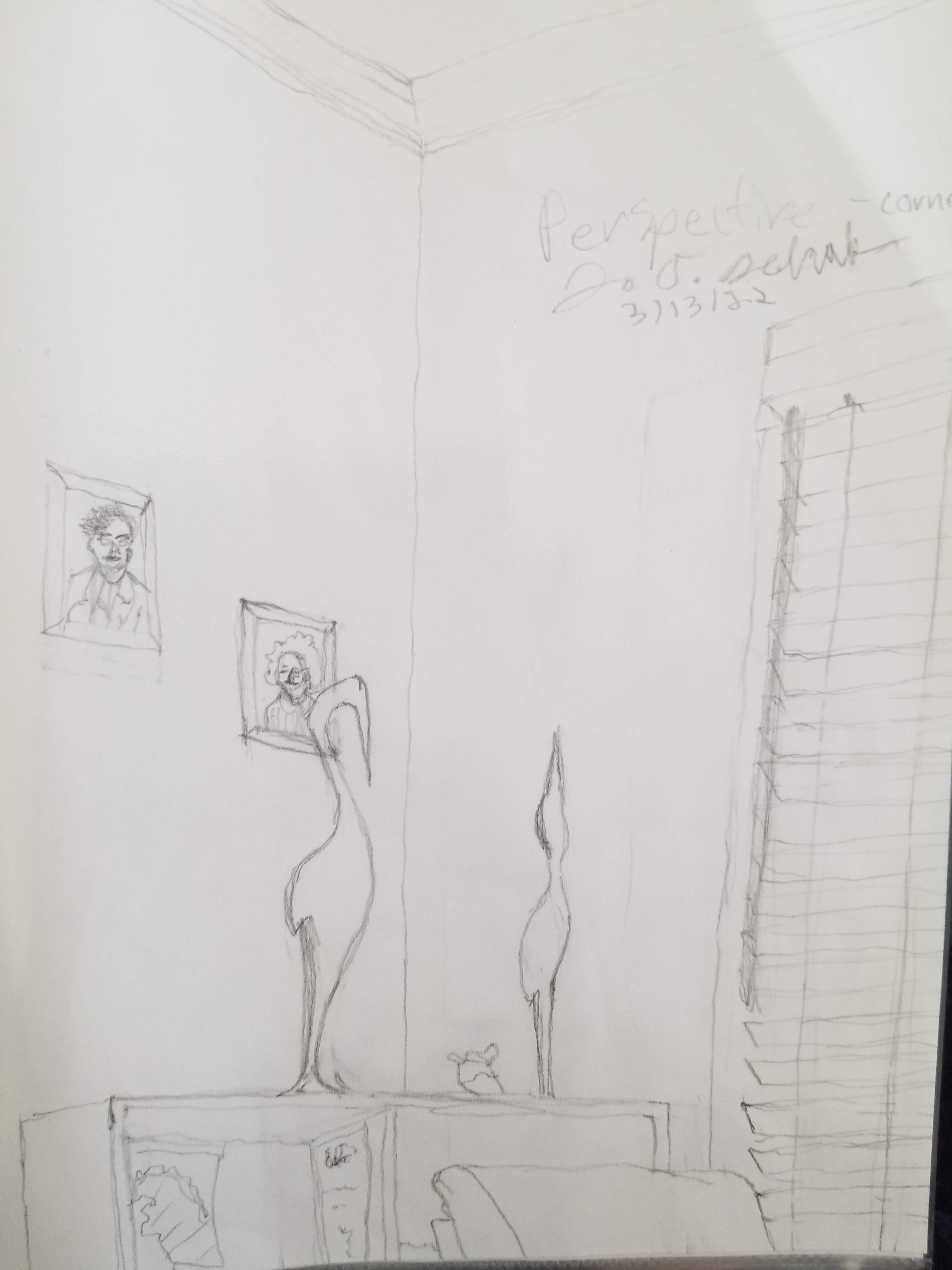
Sensing perspective. Perspective is hard because your brain is constantly telling you how objects should be arranged relative to each other. What’s level to the ground and what’s exactly vertical. But the reality is that light from objects enter your eyeballs in a very different way from their logical, objective arrangement. Horizontal edges appear diagonal because of where you are sitting, and because your eyes are flattening light from 3-d space into a 2-d image. This is perspective.
And yet your left brain does a really good job telling you how objects are supposed to be arranged, even if that’s not literally what your eyes see. The trick to drawing perspective it to draw the 2-d image you actually see, before your brain works out a 3-d interpretation. Holding a pencil or other flat object in front of you, as you imagine the drawing on your paper, can help you draw in 2-d perspective.
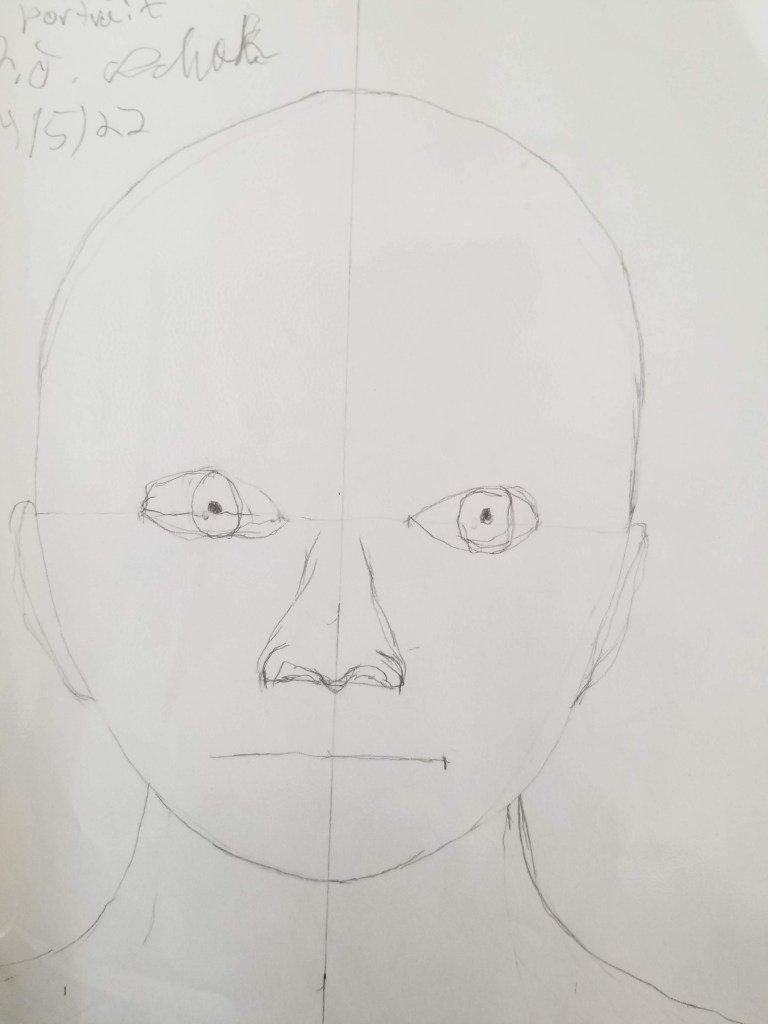
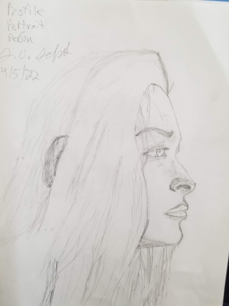
First try at profiles & headshots. Just like middle school, here I draw side and frontal shapes of heads. The forehead, ears, and mouth a tend to be bigger than we think. Human brains are huge after all! These headshots are less detailed than later drawings, but they are not too shabby. And you can see how fun it is to draw hair!
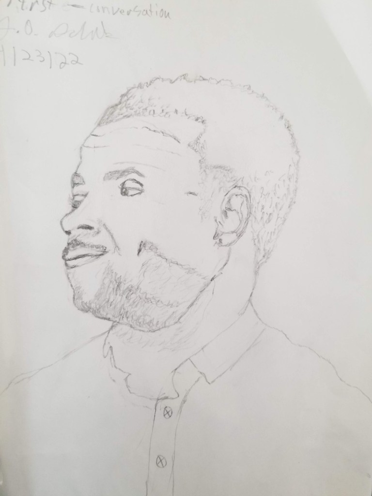
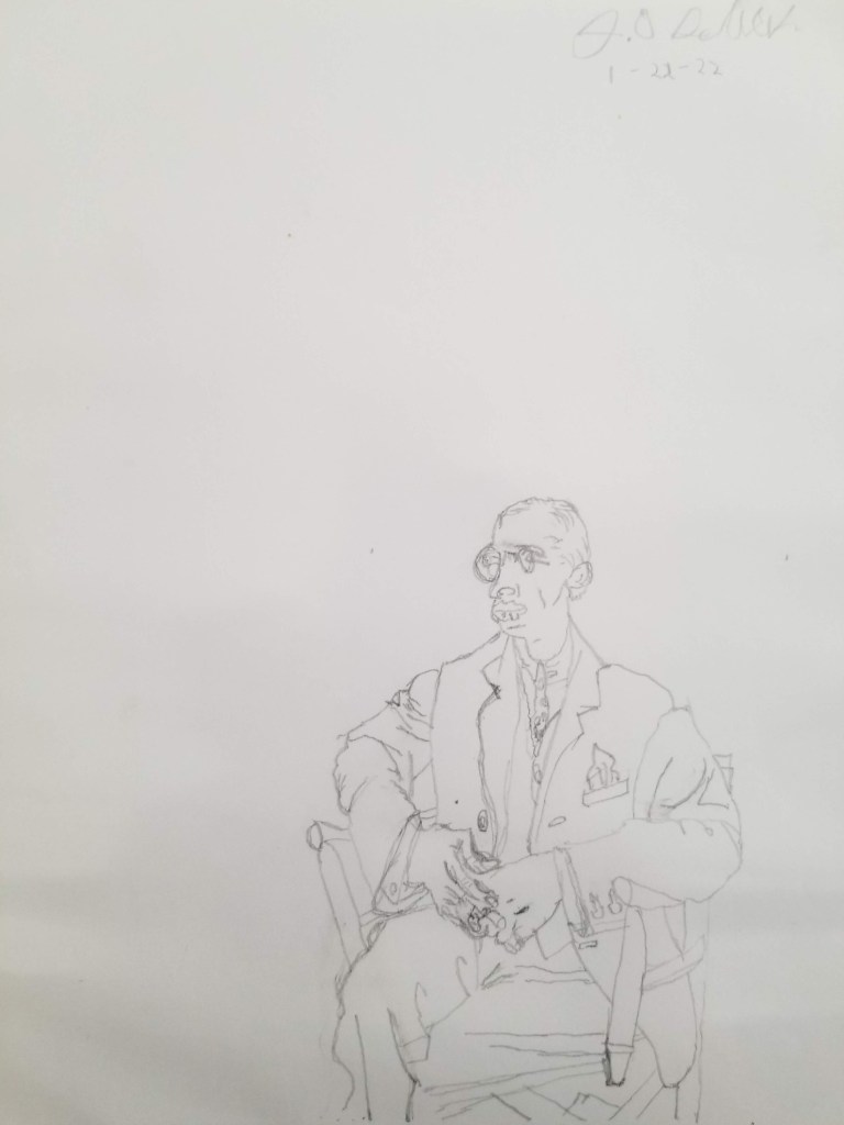
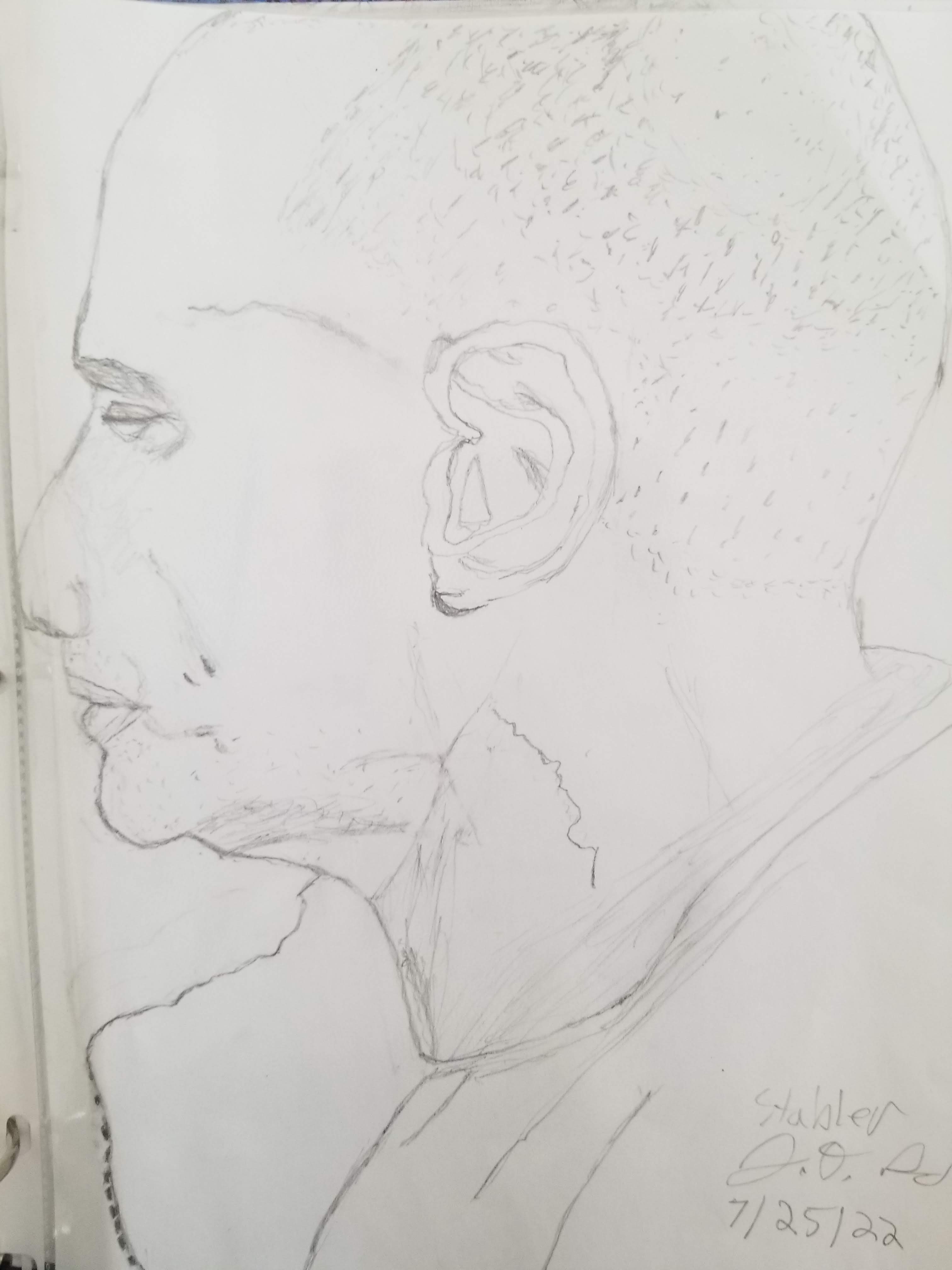
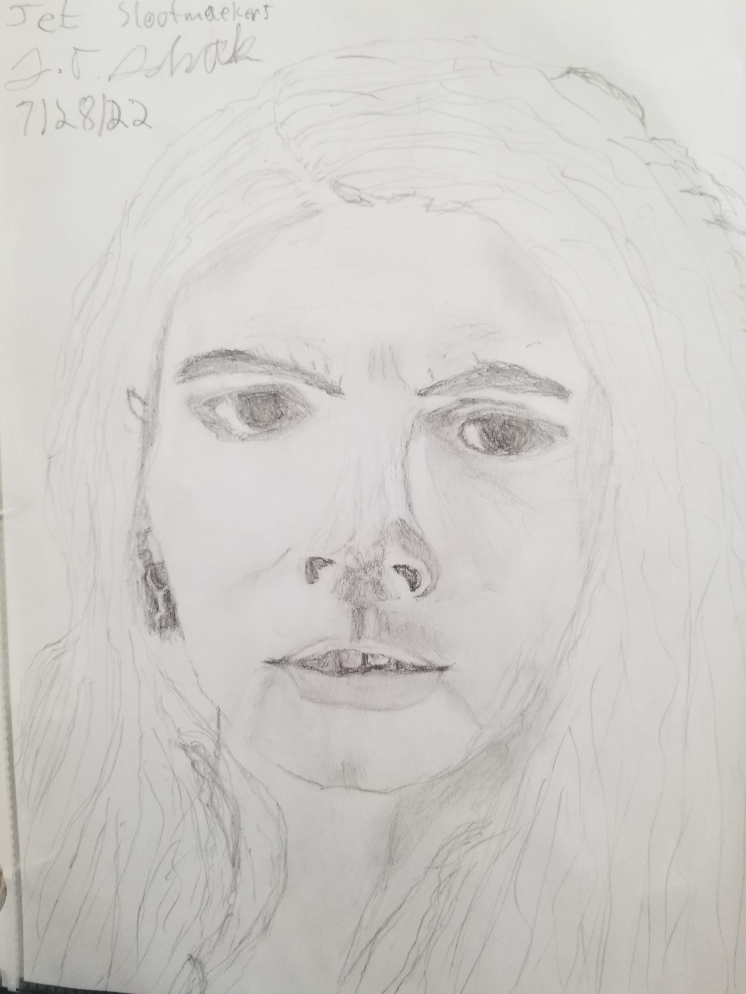
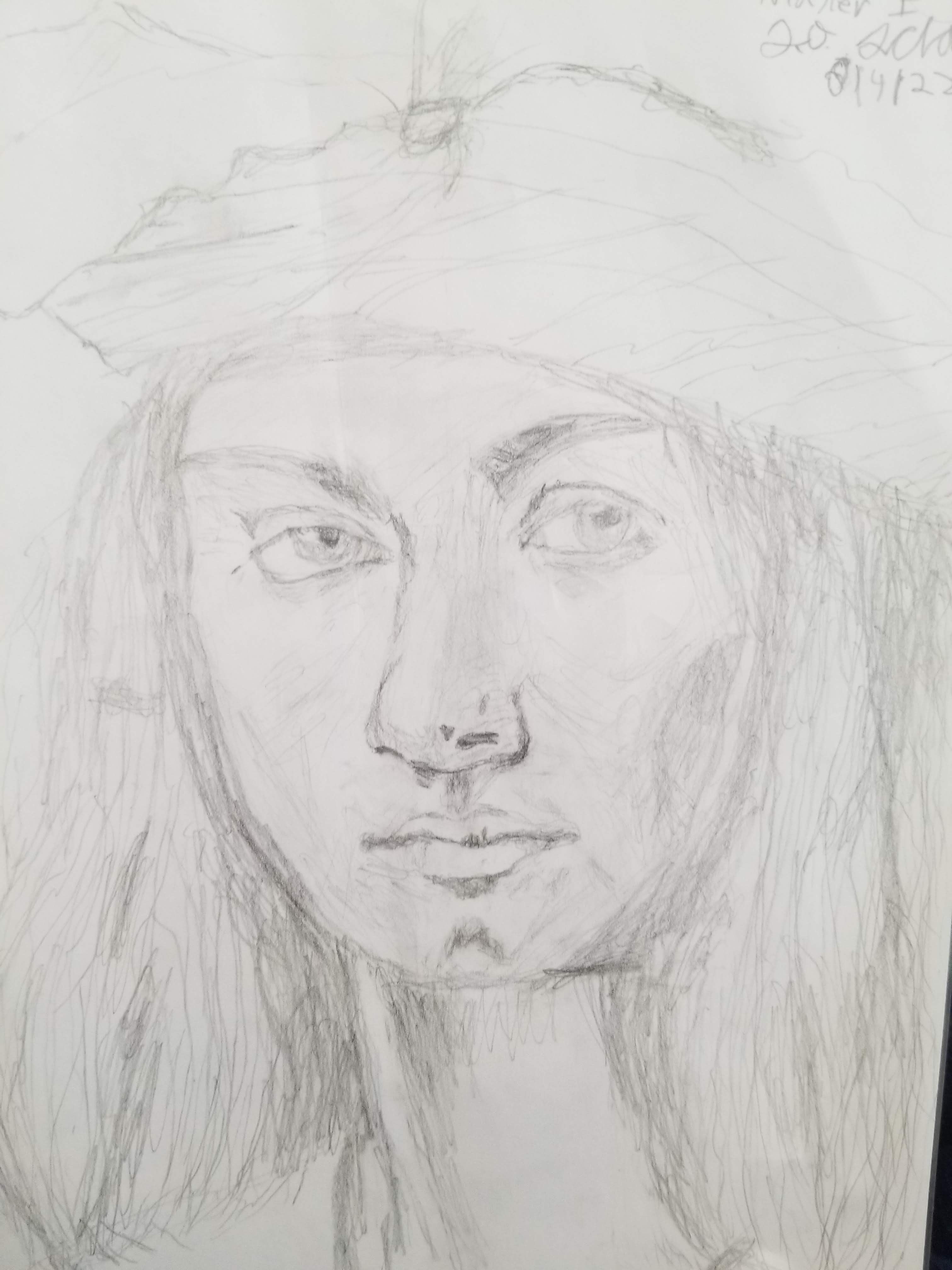
Knocking off the rust after a travel hiatus. When I traveled in Europe for two months, I went quite some time without any drawing. It’s true what they say: practice makes perfect, and if you don’t use it, you lose it. Here I struggle some with proportions and shapes. I have trouble seeing the negatives spaces and silencing my left brain. I cut off Eliot Stabler’s nose and make Jet Slootmaeker’s forehead too small, and her eyes too big and far apart. These are more caricature sketches—a left brain activity.
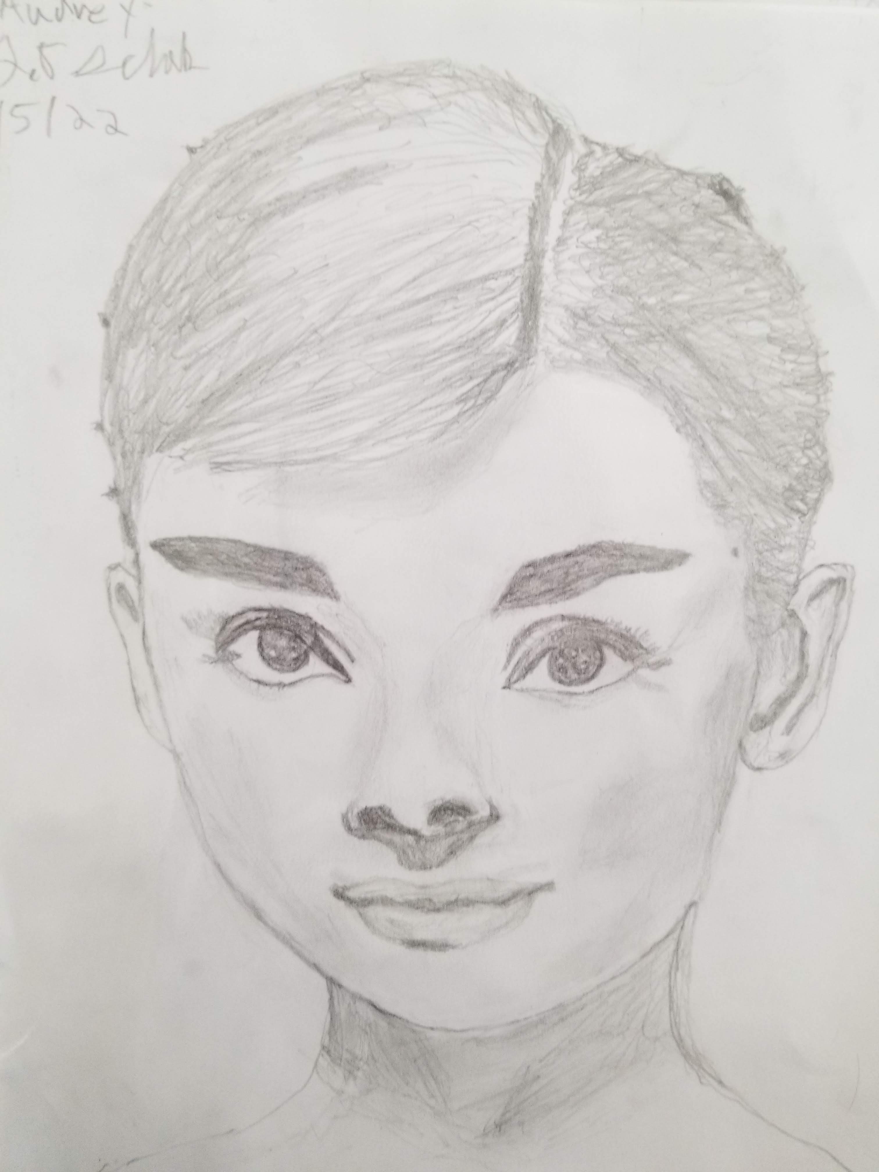
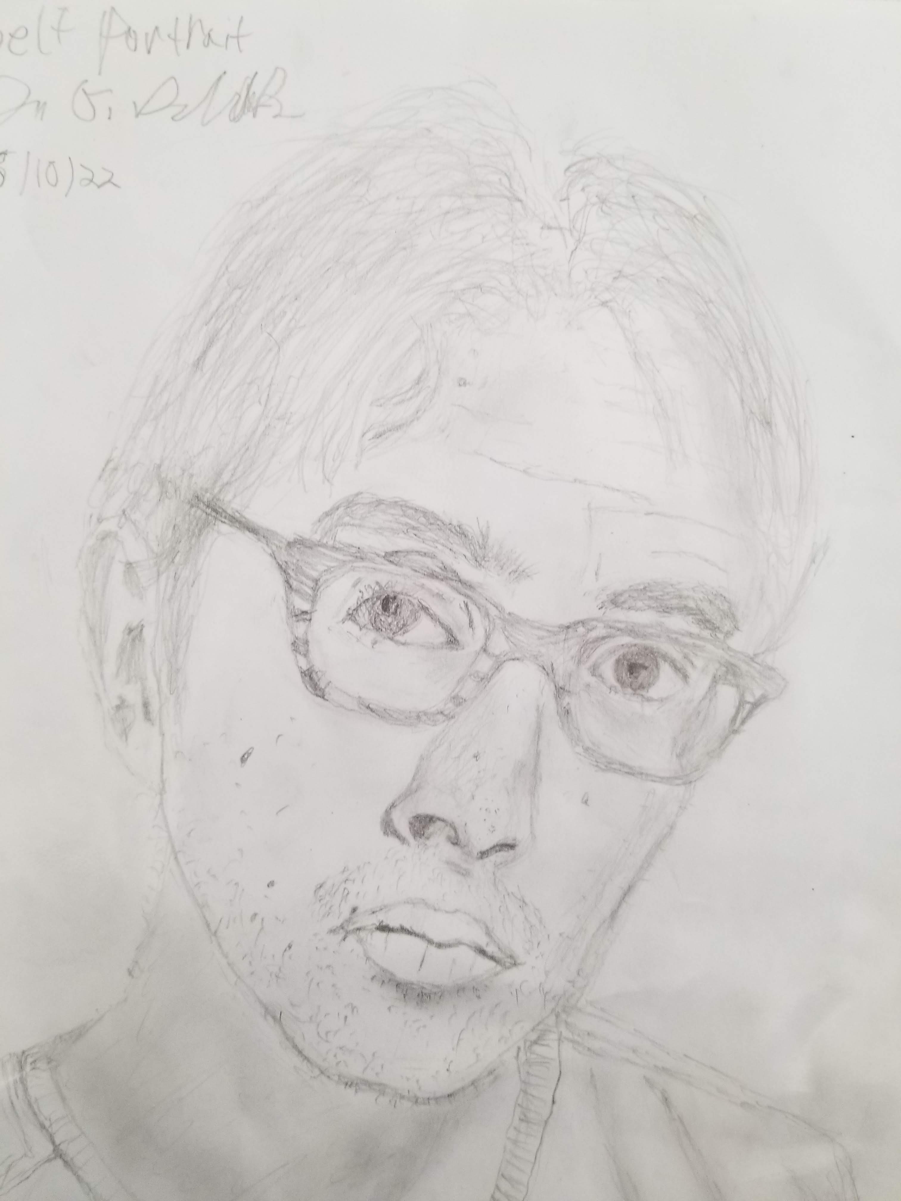
Getting the hang of it. But, within weeks, practice and patience made me so much better! Audrey is probably my favorite drawing so far. It’s not perfect (the shading and nose could be better). And yet, I nail the proportions and gestalt (whole) essence of her beauty. Everything clicks together like an lego castle. My self portrait on the right is probably the highest level of difficulty of anything I’ve done, because I had to shift my gaze up and down from the paper to the mirror, and then back again.
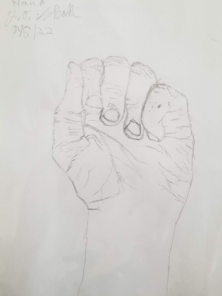
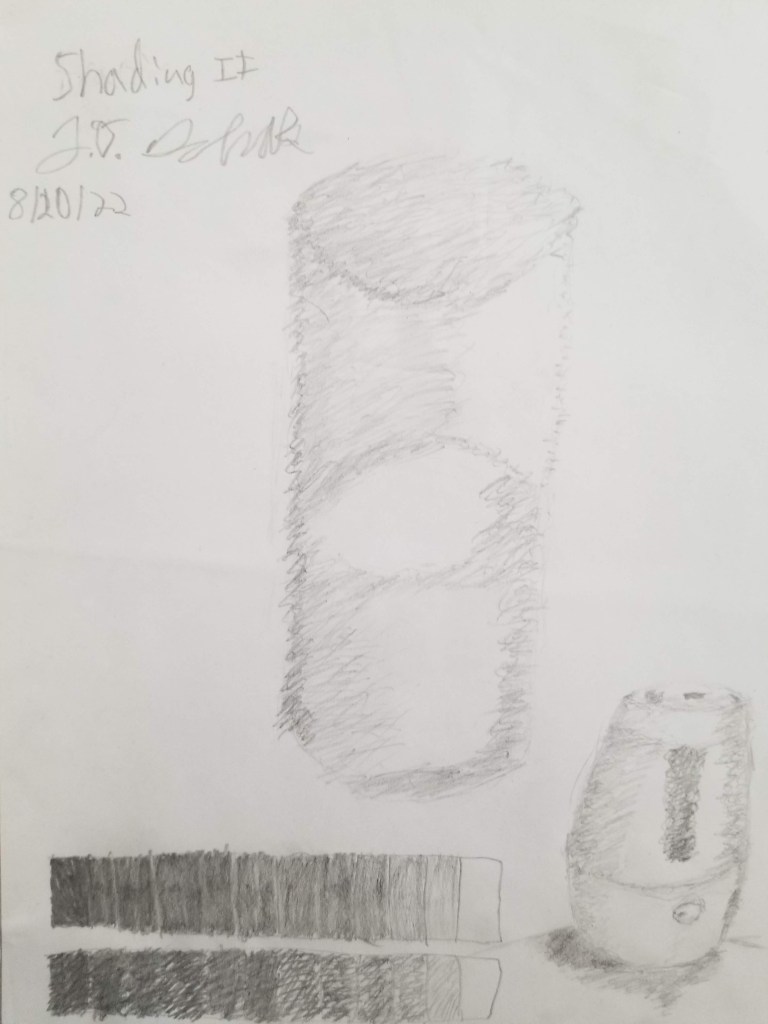
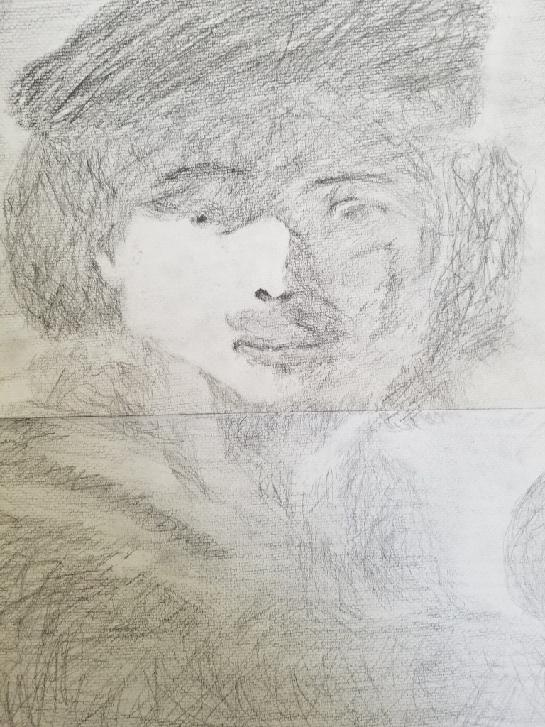
Throwing in shade. Different “values” of shading add depth to your drawings. You can evenly shade into spaces or progressively add crosshatches on top of each other, until the you make a blob with the right amount of darkness. Try to see negative spaces and shade those in to create shapes, edges, and shadows. Avoid naming or thinking logically about what’s being shaded. I find it helpful to shade in the whole canvass with a medium tone and then “draw”in the whitest values with my eraser.
Less is more here—just a few seemingly abstract blobs can form something as intricate as a face. The viewer’s mind and imagination does most the heavy lifting for you.
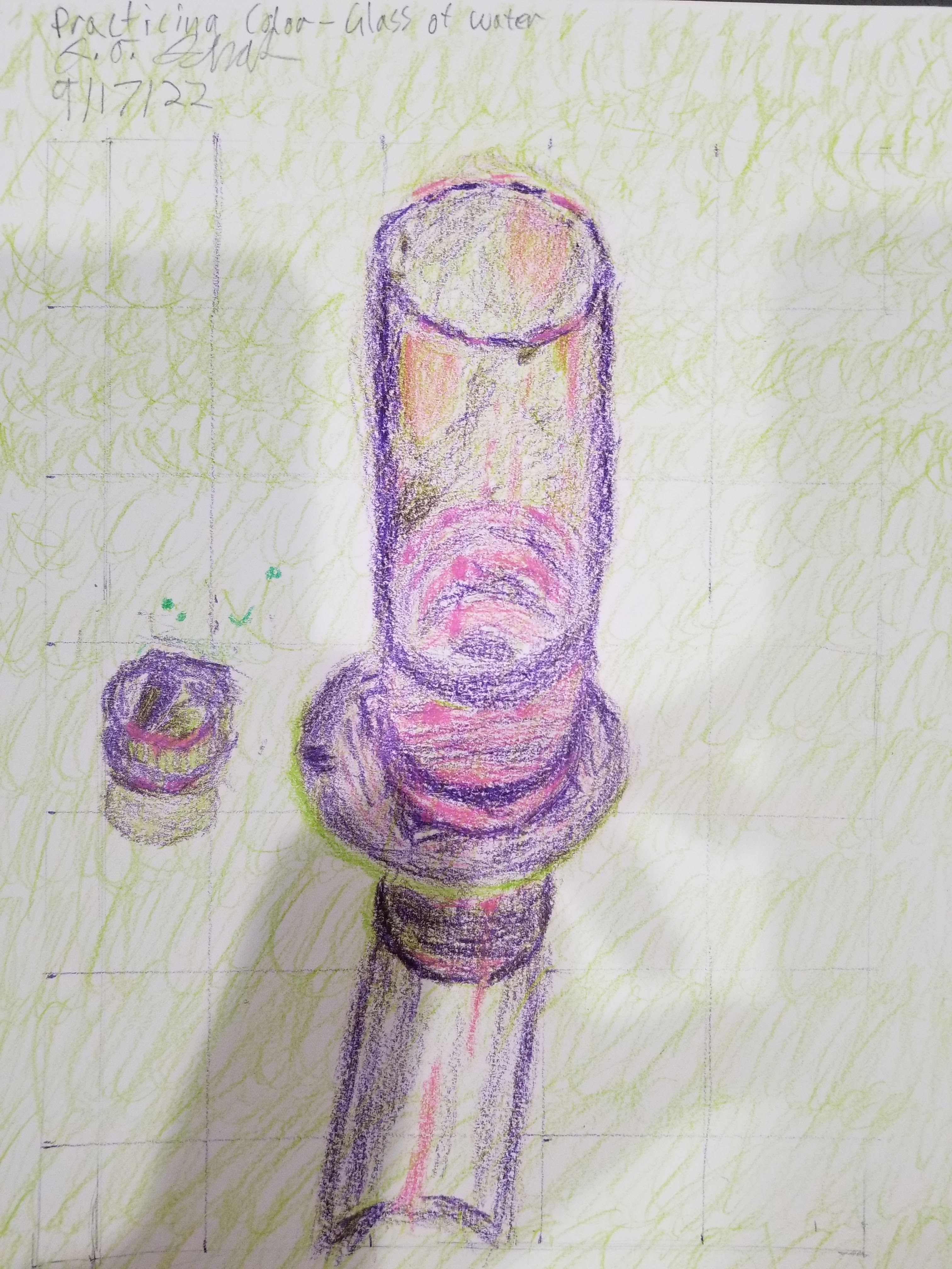
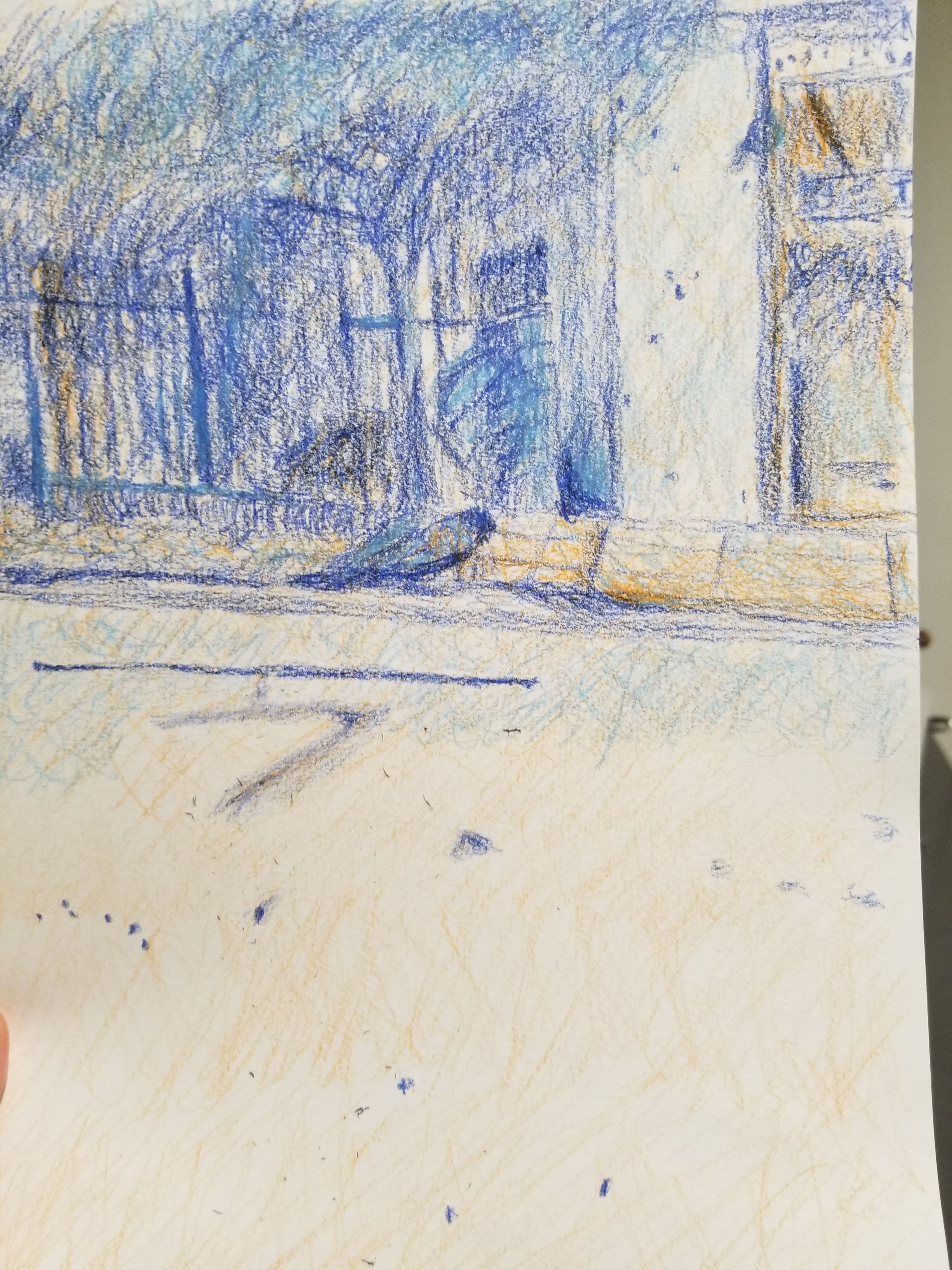
Experimenting with color. Another way to convey the emotion and vibrancy of an image is to add some color. The trick is to find a few hues (colors) that harmonize well with each other. Either complements (opposites like orange/blue) or similar colors (orange/yellow) work well. You don’t want too many hues—maybe 2 or 3.
And the colors should balance intensity with dullness. A red balloon is beautifully brilliant because it is often surrounded by muted grays and green, but you miss this if it’s next to many other shiny objects (unless that’s the effect you’re going for). Dull and dim color is like negative space. This is what makes drawings pop!
Colors are hard because, on top of hue harmonization and color balance, you are also working with different values of shading (dark and lighter variants of the same color). To make it super confusing, different hues themselves can convey a value of shading. All this gets put together to visualize various emotional vibes, shimmering of lights, casting of shadows, and, yes, colors of people and things. It’s a challenge! How did I do?
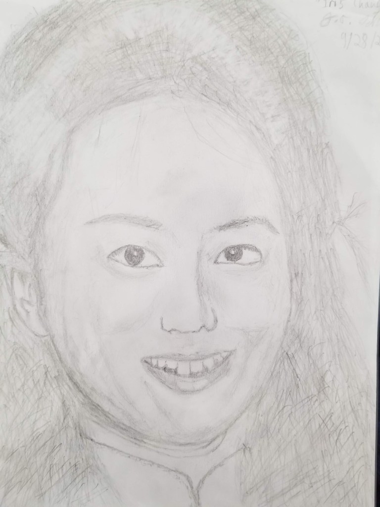
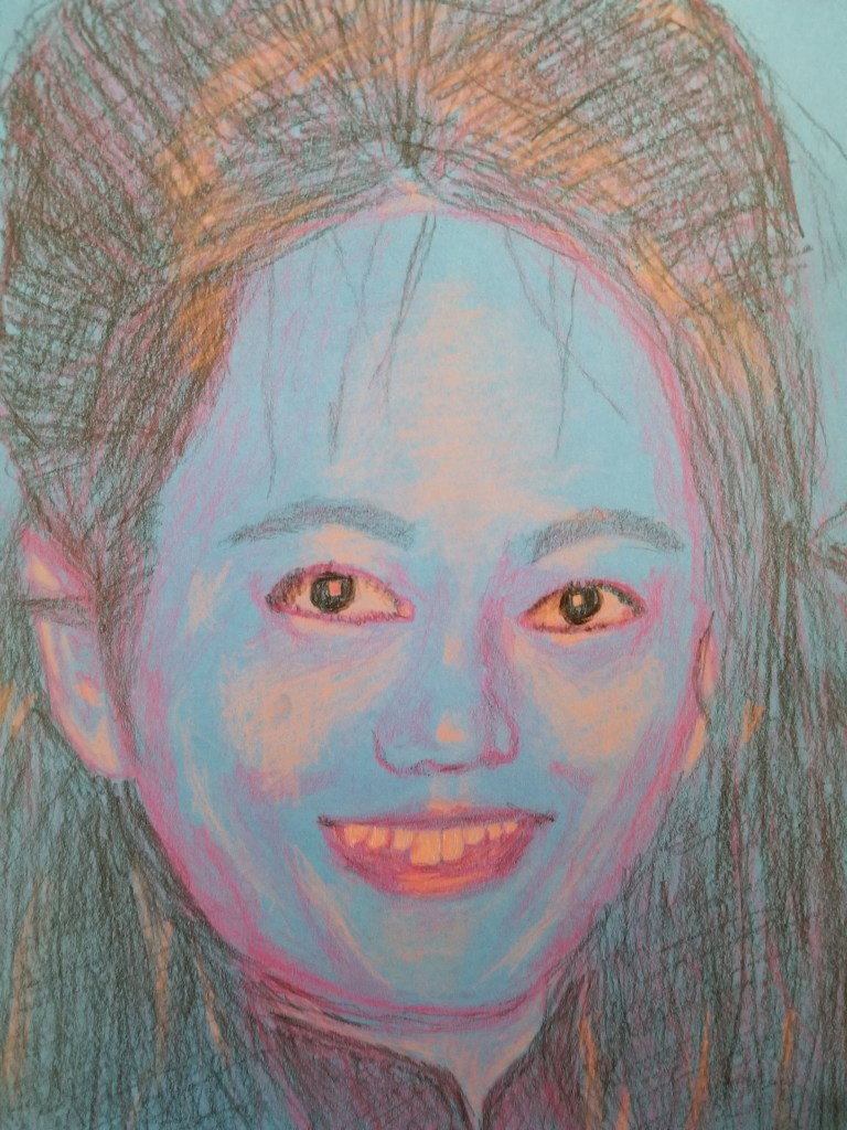
(The picture on the right is a reverse colorized copy of the middle drawing.)
Expression through art. All this drawing practice culminated in this portrait of Iris Chang, an extraordinary author and witness to history, who died way too young. You can see the unity of this drawing—the balanced features, smiling musculature, and beaming lights and shadows. In this fleeting moment, she seems joyful and poised.
I tried to harmonize several colors to create a second version that brings out a more complex mix of emotions. Some artists associate blue with truth and despondency, purple with dignity and grief, and black with strength and depression. These hues seem right for Iris, who has recently become a favorite topic of mine. I’m going to talk all about her in my next blog post.